← Back to selected work
Brand portfolio / OtterBox

Protection evolved.
Performance refined.

Two mobile-protection systems balance durability, usability and clearer brand expression—from the Defender redesign to a lighter silicone architecture.

01 / Defender redesign

More protection.
Less compromise.

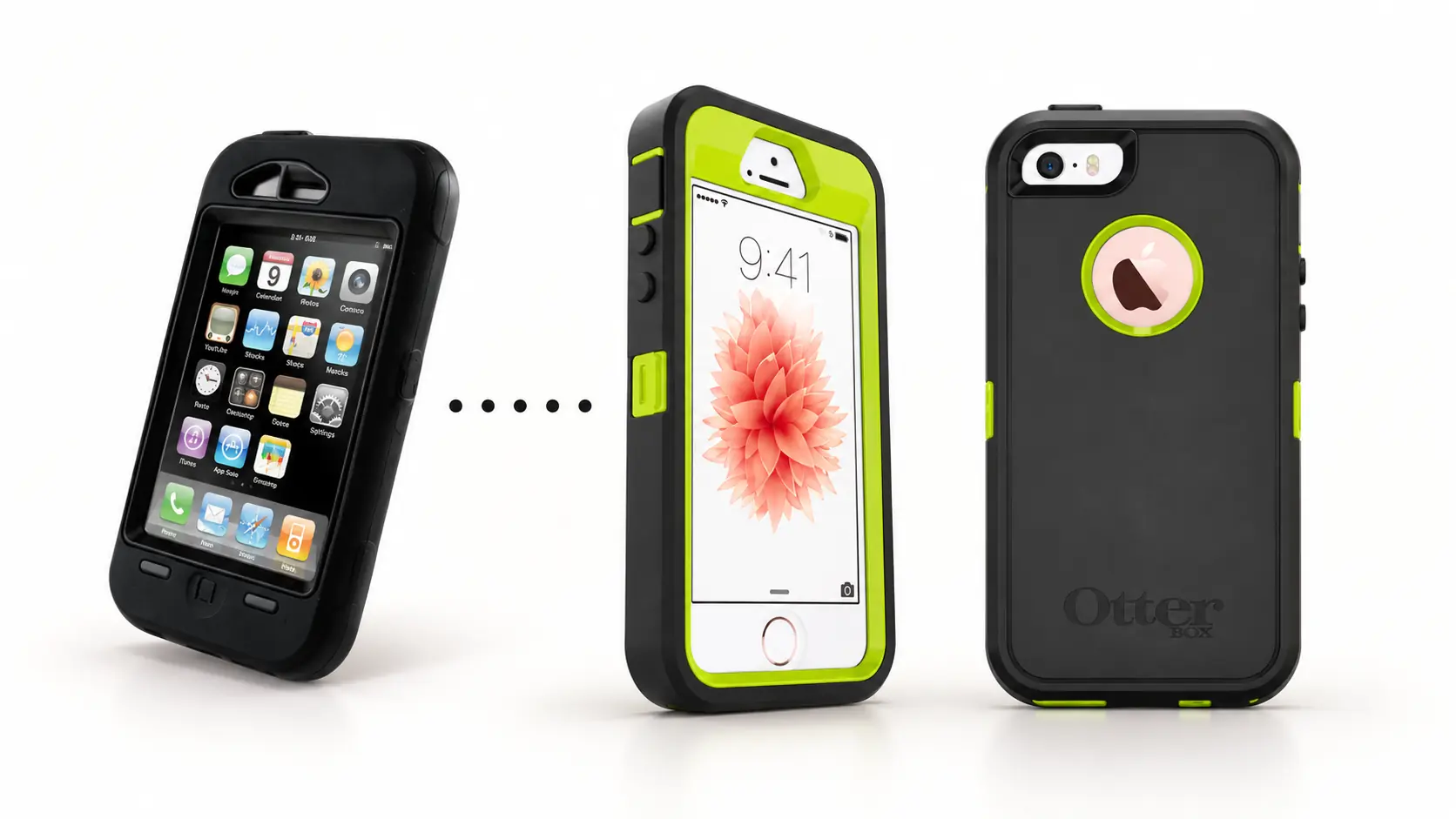
Evolution from an early black OtterBox case to the redesigned black and lime Defender case in front and back viewsPROTECTION / AUDIO / DURABILITY01
OTTERBOX · DEFENDER

Rugged protection, resolved with greater clarity

The redesign improved audio performance and durability while reducing visual complexity. A more disciplined architecture created cleaner surfaces, stronger product identity and meaningful color options.
01Improved
audio quality
02Greater
durability
03Cleaner
aesthetics
04Purposeful
color options
02 / Lightweight protection

A softer expression
of everyday defense.

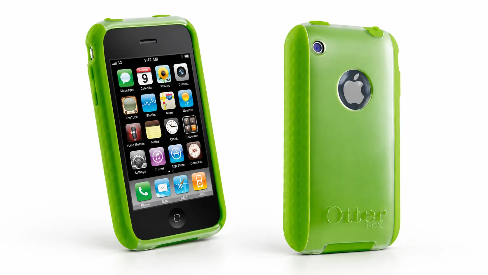
Translucent lime-green OtterBox lightweight silicone case in front and back viewsGRIP / MATERIAL / LIGHTWEIGHT02
OTTERBOX · SILICONE CASE

Secure in the hand, lighter in character

A clear polycarbonate shell and tactile silicone grip edges protect the device without hiding it. The translucent construction, textured perimeter and color range bring a more approachable expression to the OtterBox portfolio.

Leadership context

Director, Industrial Design & Engineering

In 2009–2010, John integrated industrial design, engineering and prototyping at OtterBox—helping reduce the development cycle from 16 weeks to 8 while strengthening product performance and brand coherence.

Continue the conversation

Turning protection
into product identity?

Let’s talk ↗
Case study

Discuss this work ↗